The Answer is to Deploy Now

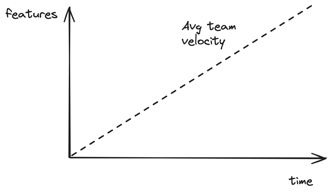
In software value is produced by features running in production. Let’s assume a team delivers on average one feature per unit of time. We will call it team velocity. We can plot their feature delivery curve.
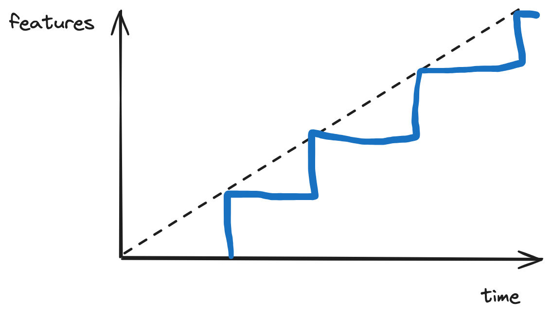
Average team velocity doesn’t tell the whole story. Features are deployed on some cadence which makes the feature curve for a team a stair step versus a continuous line. Two teams can have the same average velocity but different deployment cadences. Consider a team that deploys every unit of time and another that deploys every two units of time.
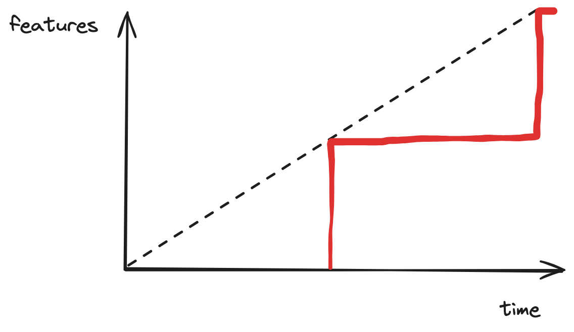
The blue team deploys one unit of features every one unit of time. The red team deploys two units of features every two units. Each has an average feature velocity of one feature unit per unit of time.
The value produced to the organization by these two teams is the area under their feature curves.
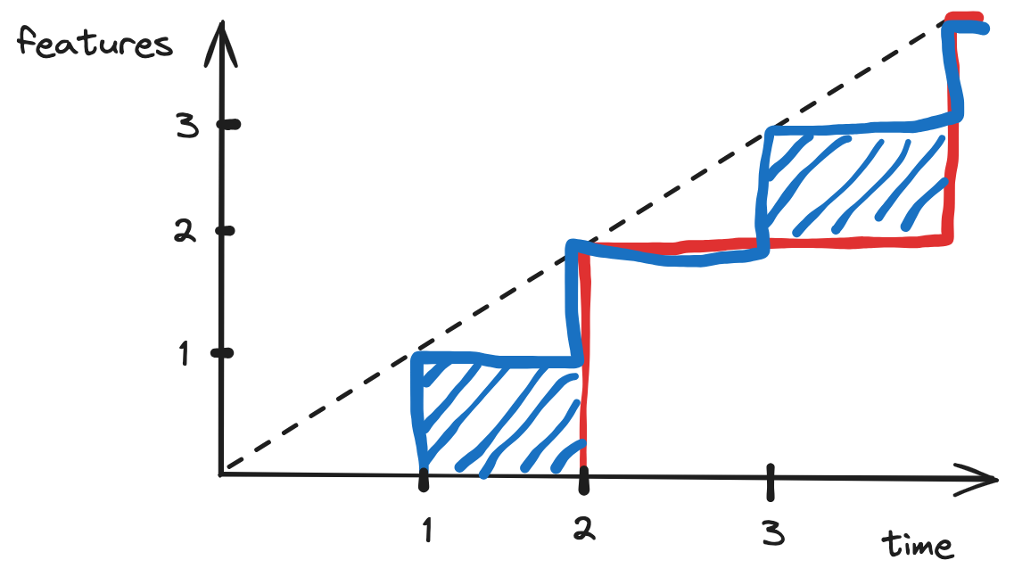
It is clear that the blue team captures one quarter (25%) more value per unit of time. Value is positively correlated with deployment frequency.
This abstracts several real world aspects that will be explored separately:
- Features pull from a distribution of value. There is always some uncertainty about how useful a particular feature will be.
- Deployment batch cost aka how much team time does a deployment take.
- Feature request rate has some dependence on latency of delivery.
- Feature request size has some dependence on latency of delivery.